We’ve seen how focusing on users can change a business’s online look. In today’s world, with lots of competition and short attention spans, making a website that grabs and connects with people is key. We are excited to share top tips for a website that puts users first, boosting your brand and building strong connections.
Key Takeaways
- Understand your target audience and their needs to deliver a tailored user experience.
- Define user personas to guide your design decisions and ensure you’re meeting their expectations.
- Prioritise user experience (UX) by focusing on intuitive navigation, clear information architecture, and seamless interactions.
- Implement responsive web design to provide an optimal experience across all devices.
- Simplify your website’s navigation to help users find what they’re looking for quickly and easily.
Understand Your Target Audience
Building a website that users love starts with knowing who they are. We do this by creating user personas and doing deep research. This helps us make a website that speaks to our audience.
Define User Personas
User personas are like fake profiles of your perfect customers. We learn about their age, what they do, what they want, and what problems they face. We use surveys, interviews, and data to find this out. This way, we can make our website just for them.
Conduct User Research
User research is key to a great website design. We use A/B tests and watch how people use our site. This tells us what works and what doesn’t. It helps us fix problems and ensure our site is all about the user.
| User Research Methods | Key Insights Gained |
| Surveys | – Demographic information- User preferences and pain points- Feedback on existing website |
| Interviews | – In-depth understanding of user goals and behaviors- Insights into decision-making processes- Identification of unmet needs |
| Usability Testing | – Observation of user interactions with the website- Identification of navigation and functionality issues- Evaluation of overall user experience |
By really getting to know our audience, we make sure our website hits the mark. It’s all about giving them what they need and want.
Prioritise User Experience (UX)

At the core of every successful web project, focusing on user experience (UX) is key. As web developers and digital agencies in Australia, we know that making UX a top priority is essential. It helps create a website that connects with your audience. We aim to make your website easy to use, simple to navigate, and smooth for users.
We work closely with UX designers who are experts in making your website better. They focus on the layout, how users interact with it, and how it looks. By doing deep research and testing, we find out what users want. This helps us make your website focused on the user.
- We start by understanding what your audience needs, what problems they face, and what they like.
- Then, we create user personas to guide the design of your website’s features and how it works.
- We make sure the website is easy to get around and find what you need.
- We improve how the website interacts with users to make their experience smooth and fun.
- We make sure the design looks good and fits your brand, making users feel connected.
At our Web Developers Australia and Digital Agency Australia, we think focusing on user experience is key to making great websites. These websites don’t just look good; they also help your business grow. We focus on design that puts users first, making your online presence strong and engaging.
| UX Design Element | Importance | Key Considerations |
| Information Architecture | High | Intuitive navigation, content hierarchy, and ease of information discovery |
| Interaction Design | High | Seamless user flow, responsive interactions, and intuitive user controls |
| Visual Design | High | Aesthetically pleasing, brand-aligned, and visually engaging layout |
“Prioritising user experience is not just a best practice, but a necessity in today’s competitive online landscape. A well-designed, user-centric website can be a powerful differentiator and a key driver of business success.”
Implement Responsive Web Design
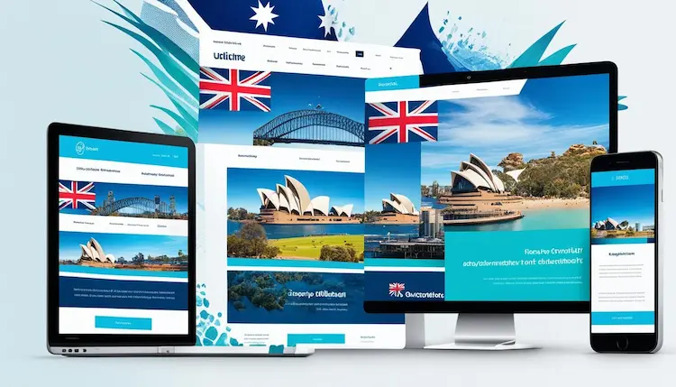
In today’s world, having a website that works well on all devices is key. Responsive web design makes sure our Australian online presence meets the needs of both desktop and mobile users. This way, everyone gets a great experience, no matter the device.
Optimise for Mobile Devices
Now, making our websites mobile-friendly is essential. We need to make sure our Australian websites work well on smartphones and tablets. This means using smart layout techniques, making images smaller, and ensuring pages load quickly on mobile.
Test Across Multiple Platforms
- We test our website on different devices, from the newest phones to older ones, plus tablets, laptops, and desktops.
- We fix any problems we find to make sure our Australian online presence is smooth and consistent on all devices.
- We use Google’s Mobile-Friendly Test to check how well our site works on mobile and find ways to get better.
By using responsive web design and testing on various devices, we make sure our Australian online presence is great for everyone. Whether it’s on a desktop, smartphone, or tablet, our content is easy to use and enjoyable.

Simplify Navigation
At the core of professional web design in Australia is making it easy to get around. We aim to make our website a guide that leads visitors smoothly through its content. This way, finding what they need is a breeze. By keeping things simple and clear, we boost the user experience and make sure our Australian audience finds our site easy to use.
We focus on a few key things to make this happen:
- Logical Content Structure: We organize our website’s content in a clear and logical way. This includes using intuitive categorization and subheadings. It helps users quickly get the hang of how the site is set up.
- Consistent Navigation Elements: We use the same friendly navigation tools like menus, breadcrumbs, and search across the site. This makes it easy for visitors to move around.
- Mobile-Responsive Design: Our responsive web design in Australia works great on all devices and screen sizes. This means a smooth navigation experience on both desktop and mobile.
| Navigation Element | Purpose |
| Primary Menu | Provides access to the main sections and categories of the website |
| Breadcrumbs | Displays the user’s current location within the website’s hierarchy, helping them orient themselves |
| Search Functionality | Allows users to quickly find specific content or information on the website |
By using these best practices in our professional web design in Australia, we make a navigation system that helps our users. It improves their experience, leads to more engagement, and makes our website more satisfying for everyone.
Web Design Company Australia
At our web design company in Australia, we’re all about making websites that meet our clients’ specific needs. Our skilled web designers and developers work together to make websites that look good and work well. They ensure a smooth experience for everyone who visits.
Every website we make is unique, whether it’s for a small business or a big company. We know your website is your online face. So, we focus on custom website development and e-commerce website design in Australia. We make sure your site shows off your brand and connects with your customers.
- Comprehensive website design and development services
- Responsive web design optimized for all devices
- Seamless integration of custom features and functionalities
- Ongoing support and maintenance for your website
We keep up with the latest in web design to make sure your site is both beautiful and easy to use. This keeps your customers happy and coming back. We can handle everything from custom content systems to e-commerce solutions, making your online dream a reality.
If you want a web design company in Australia that offers custom solutions for your business, contact us. Let’s create a website that looks amazing and helps your business grow.
Optimise for Speed
Speed is key when making a great website. As a top web design company Australia, we know how vital it is to make your site fast. By cutting down on HTTP requests and making images and media smaller, you make sure visitors have a smooth, quick visit.
Minimise HTTP Requests
Reducing HTTP requests is a big step towards a faster website. You can do this by making your code better and using fewer external scripts and stylesheets. Combining and shrinking your files makes pages load faster, giving users a better website design services Australia experience.
Optimise Images and Media
Images and videos can slow down your site if not managed well. To keep pages fast, you need to make these elements smaller. This means compressing images, choosing the right formats, and using lazy loading to only load when needed. These steps help make your site quick and engaging, keeping visitors interested and coming back.
At our web design company in Australia, we focus on making websites that are fast and user-friendly. By using these tips, you can make sure your site is quick, works well for users, and ranks better in search engines.
Ensure Accessibility
Adding accessibility to our design is key. This means giving images alt text, making sure you can navigate with a keyboard, and keeping colors clear for everyone. By doing this, we make digital agency Australia sites that everyone can enjoy, no matter their abilities.
Accessibility in Action
Here’s how we make our web projects accessible:
- Alternative text for images: We add descriptive alt text to images so people with visual impairments can understand them.
- Keyboard navigation: Our sites work well with just a keyboard, so you don’t need a mouse.
- Color contrast: We keep text and background colors clear enough for people with vision problems to read easily.
- Accessibility testing: We check our sites with special tools and get feedback from users with disabilities to fix any issues.
By focusing on accessibility, we make sure our digital experiences are open to everyone. This helps users with disabilities and makes the web better for everyone.
“Accessibility is not just a legal requirement; it’s a moral and ethical imperative. By designing for accessibility, we ensure that everyone has an equal opportunity to access and engage with digital content.”
At our web developers Australia and digital agency Australia, making things accessible is a big part of what we do. We aim to create web experiences that welcome everyone and make them feel empowered.
Also Read: 6 Reasons Why Websites Should Use Accessibility Overlays
Incorporate Visual Hierarchy

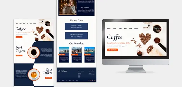
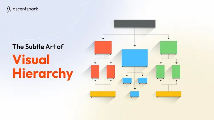
Creating a user-centric website in Australia means focusing on a strong visual hierarchy. This is key to guiding users and highlighting important info. By using design elements like font size, color, and layout, we can make a clear visual flow. This draws attention to the most important parts of your pages.
Font size is a big part of visual hierarchy. Bigger fonts grab the user’s eye, perfect for headings and subheadings. Smaller fonts are good for less important stuff, like body text or secondary details. This careful use of font sizes helps guide the user through your site.
Color is also a powerful tool. Bright, high-contrast colors can highlight important actions or features. Less vibrant tones are good for supporting elements. Using color right can make your website stand out and guide users to key info.
Whitespace, or space, adds to a strong visual hierarchy. It helps organize and focus the user’s attention on key content. This approach reduces distractions and guides the user’s eye through your site.
The layout of your page also impacts visual hierarchy. By placing important info like headlines and calls-to-action strategically, you ensure users quickly spot and engage with your site’s main points.
By applying these visual hierarchy principles, we can make a website that looks good and guides users well. This approach boosts user engagement and supports the success of your online presence in Australia.
| Design Element | Impact on Visual Hierarchy |
| Font Size | Larger font sizes draw attention to headings and key information, while smaller font sizes are used for less important details. |
| Color | Bright, high-contrast colors highlight important calls-to-action and features, while muted tones are used for supporting elements. |
| Whitespace | Strategically incorporated whitespace creates a sense of organization and focus, guiding the user’s attention to the most important content. |
| Layout | The arrangement and positioning of elements on a page can emphasize the most crucial information, such as headlines, calls-to-action, and primary features. |
“Effective visual hierarchy is the foundation of a user-centric website design that captivates and guides your audience.”
Leverage White Space
At the core of a top-notch web design in Australia is the smart use of white space. As experts in web design, we know how crucial effective white space is for your website’s user experience. It lets your audience focus on the key parts easily.
Using white space is more than just leaving empty spots on the page. It’s a thoughtful approach that boosts readability, directs user attention, and creates balance and order. In responsive web design in Australia, white space is key. It keeps your content looking good and easy to use on all devices.
Amplify Readability with Thoughtful White Space
Well-placed white space can greatly improve how easy your website’s content is to read. By adding space between paragraphs, lines, and elements, we make your text easy to scan. This way, your users can quickly find the info they need.
Enhance Visual Hierarchy with Negative Space
Smart use of white space helps us set a clear order in our design. It guides your users to the most important parts. By giving key elements some space, we highlight calls-to-action, special features, and other important info. This makes your website better for users.
Achieve a Balanced, Uncluttered Design
A good website should never feel too much or confusing. With white space, we can make your design balanced and elegant. This lets your brand and message stand out without distractions. This simple style looks good and makes your website easy to use.
Using white space well is key to great web design in Australia. By balancing content and space, we create designs that grab your audience and make a strong impact. Get ready to boost your online presence and give users an amazing experience.
Conclusion
Making a website that focuses on users is key for Australian businesses. It helps them connect with their audience, make the user experience better, and increase sales. By following the 10 tips in this article, you can make a site that puts users first and boosts your online presence.
